![]()
Braille block (official name “Blind guidance block for visually impaired people”) is a plate laid on the ground or floor to safely guide the visually impaired. The protrusion is attached to the surface so that it can be recognized with the touch sense of the foot sole and the cane. It was invented by Mr. Seiichi Miyake in 1965. In 1967, it was installed in the world for the first time at an intersection near Okayama Prefectural Okayama School for the Blind.
The Heart Building Act was established in 1994 and the Traffic Barrier – Free Act (aka “commonly called”) was established in 2000. According to these acts, the standards for the establishment of Braille block have been established for “Public Transportation Guidelines” and “Road Maintenance Guidelines” (commonly known).
Today, Braille blocks are being installed not only in public facilities, sidewalks, railway stations but also in private shops and facilities. However, since Braille blocks of various colors and shapes have become widespread, in order to unify them, the Japanese Industrial Standard (JIS) adopted JIS T 9251 (the shape and dimensions of protrusions such as block for guiding the visually impaired and its arrangement) in 2001. It defined the shape of Braille block by this.
In 2012, the international standard of braille block was established based on JIS in Japan. Now it is spreading to many countries. I will briefly introduce what the standard is.
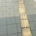
Guidance block ( Linear protrusion )
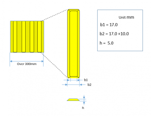
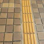
The guiding block is shown in Figure 1. Blocks are spread in a line to guide the visually impaired in the direction of linear protrusions. The main dimensions determined by JIS are shown in the figure. In JIS, the criteria is determined over details, such as tolerances of dimensions and spacing of protrusions.
- It is a square with one side of 30 cm or more, and the number of rod-like linear protrusions with the lower limit of 4 is increased according to the block size.
- It indicates the direction of movement in the longitudinal direction of the rod.
- The cross section has a half dome shape, and the ground plane with a shoe must be flat.
Warning block ( Punctiform protrusion )
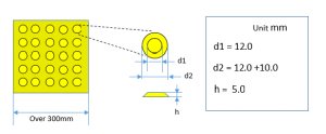
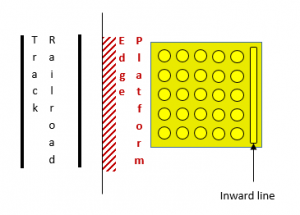
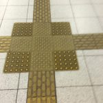
Warning block is shown in Figure 2. This block has a role of calling attention. This is used in front of the stairs, before the pedestrian crossing, at the end of Braille block, at the branch or turning point of blocks, in the vicinity of the end of the station platform, in front of the guide board, at the entrance to the elevator and so on. At the station platform, Warning block with an inward line as shown in Figure 3 is often installed, which informs that the inward line side is the safety side.
- It is a square with one side of 30 cm or more, and the number of dot-shaped protrusions is set to 25 (5 × 5) points as the lower limit and is increased according to the block size.
- The arrangement of the dot-shaped protrusions is arranged in parallel as shown in the figure. (All protrusions line up in vertical and horizontal lines.)
- The cross section has a half dome shape, and the ground plane with a shoe must be flat.
Regarding the color of Braille block, there is no provision in JIS, and it is indicated in the guidelines of the Ministry of Land, Infrastructure, Transport and Tourism as follows.
“The color of the block for guiding the visually impaired should be a color that can easily distinguish the block part due to a high luminance ratio such as yellow to other surrounding road surface.”
(The Ministry of Land, Infrastructure, Transport and Tourism, ministerial ordinance, No. 116. “Ministerial Ordinance that establishes standards for the structure of roads necessary for facilitation of movement etc. Article 34 Clause 2”)
At present, yellow Braille blocks are often installed in sidewalks and at the train station platform. However, at the railroad station, we often see other colors used in the station buildings, commercial facilities, passageways, from the point of view of design. As other colors, I have seen colors such as silver, black, beige, red brown etc. Apart from whether or not the color is appropriate in that environment, the luminance ratio between the surrounding ground and the Braille block is very important not only from the design point of view. Many people must understand that Braille blocks are not only used by blind people but also by low vision people.
Actual status of braille block and the App
・Warning block is installed in the part where the guiding block branches.
App: “Braille block may be in front, right diagonal direction, next left diagonal direction. Warning block is recognized. The route has a branch on the way to the left.”
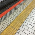
・Warning block with the inward line in Fig. 3 is installed.
App: “Braille block may be in front, right diagonal direction. Warning block is recognized. Railroad track on the left, ahead. Please be careful.”
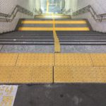
・Warning block is installed in front of the stairs and at the end.
App: “Braille block may be in front, lateral direction. Warning block is recognized. Railroad track ahead. Please be careful.”
・Because the surrounding ground is a yellow tile, The “Braille block” App recognized as a braille block including tiles. Therefore, I adjusted the parameters used in the program.
・ Contrary to Figure 7, the App may not be able to recognize dark Braille block.
・The outdoor Braille block has lost yellow due to aging and become grayish. Therefore, the App can not recognize.